It's conventional wisdom that new highs in the stock market should be confirmed by "healthy breadth." In other words, you want to see a large number of stocks in uptrends as the index price moves higher. Similarly, small cap stocks should outperform the relatively fewer number of large cap stocks as breadth broadens.
All of this sounds intuitively correct: a broader foundation should equal a more solid market. Conversely, a narrowing market should be a warning of a likely market top. This is how most pundits use breadth to anticipate market inflection points.
But there are two problems with this view on breadth.
Most importantly, the conventional wisdom about "healthy breadth" being critical for future stock market returns is empirically false. Indices have typically been driven higher based on a small number of stocks contributing disproportionately large gains. Over the past 20 years, just 4% of stocks have typically accounted for almost 70% of annual gains in the SPX.
Moreover, most market drops over the past 15 years, including those with declines of more than 10% or 20%, have started when 80-90% of stocks have been in an uptrend. In fact, over the past 5 years, the SPX has gained more than 3 times as much over the following month when breadth was weak compared to when breadth was "healthy." Risk/reward has been more than twice as favorable when breadth has been weak as when it was healthy. The conventional wisdom on breadth and future market returns has been exactly wrong.
The second problem is that stock pundits' views on breadth conflict with their views on investor sentiment. Important market tops are defined by excessive investor bullishness: "everyone" is a bull by the end of a bull market. But think about what this means for breadth: if investors are bullish, they should be less selective about which stocks they own. They should seek to own the riskiest, highest beta stocks in the market. This means that market tops should be defined by broad, not narrow, breadth. By the time breadth is "healthy", investors are overwhelmingly bullish and the market tops.
No single indicator is sufficient in assessing market inflection points. Using breadth has serious drawbacks. But this post suggests a far more logical and useful methodology for using breadth to anticipate market inflection points than "lagging breadth," "breadth divergences, " or outperformance by small caps stocks.
* * *
It's conventional wisdom that new highs in the stock market should be confirmed by "healthy breadth." In other words, you want to see a large number of stocks in an uptrend, trading above their moving averages, as the index price moves higher.
Yet, consider the following:
Yet, consider the following:
At the October 2007 peak in the stock market, almost 85% of stocks were above their 50-dma. The index dropped 10% in the next month and 50% in the next year.
In April 2010, almost 95% of stocks were above their 50-dma and 200-dma. The index dropped 15% in the next two months.
In May 2011, 80% of stocks were above their 50-dma and more than 90% above their 200-dma. Just three months later, the index was 20% lower and feared to be in a new bear market.These are not isolated examples where breadth was considered "healthy" and the index was near a significant top. Others are highlighted below. In the past 15 years, almost every significant market drop was preceded by an overwhelming majority of stocks in the SPX being in an uptrend. An exception was the initial 10% fall in August 2015. Enlarge any chart by clicking on it.

The index, of course, can continue to move higher when breadth is healthy, as it notably did in 2013 and 2014 (and parts of any year in a bull market). Strong trends are defined by their ability to stay "overbought," which makes timing market tops notoriously difficult. But it is clear that "healthy breadth" is not a reliable indicator of a solid market if the stock market can fall 10, 20 and 50% shortly after breadth is deemed healthy.
Another common measurement of breadth is the cumulative advance-decline line, which sums the net number of stocks moving up on the day added to yesterday's total. The idea is that when the cumulative advance-decline line is rising, more stocks are moving higher and breadth is considered healthy.
The next chart looks at the cumulative advance-decline line (top two panels) relative to the index (bottom panel). The vertical lines mark drops of more than 5% in SPX over the past 8 years.
We see again that market drops are overwhelmingly preceded by what would be considered to be "healthy breadth," i.e., new highs in the cumulative advance-decline line. This includes several 10% declines and the 20% decline in 2011. It's true that the cumulative advance-decline line peaked 4 months before the market in 2007, but it has missed every decline since then. It's hard to be confident in a measure of "healthy breadth" that misses so many market corrections.

If the index experiences its first 5% drop in the next few weeks, it will have once again been preceded by this week's new highs in the cumulative advance-decline line. That has been the typical pattern.
Aside from a significant empirical problem, measuring the health of breadth by the cumulative advance-decline line also suffers from a conceptual problem. If a lot of small stocks move up by one penny on low volume but slightly fewer large companies move down a dollar on high volume, the cumulative advance-decline line still moves higher. Or, if a large number of defensive stocks move up while "risk-on" cyclical stocks move down, the cumulative advance-decline line moves higher. Neither of these is a sign of market health. So, forced to choose, it would be better to utilize the percentage of stocks trading over their 50-dma or 200-dma.
If "healthy breadth" is not a reliable indicator of a solid market, is the reverse also true, i.e., that very weak breadth is associated with lows in the market from forward returns are very good? As it turns out, the answer is mostly 'yes.'Market bottoms tend to be easier to identify than tops. Sharp falls in the index are associated with panic selling. Investors typically become bullish at varying rates but they become bearish all at once. Why? Because the fear of loss is much more powerful than the allure of greed. Humans evolved to protect themselves from harm first.
Many conventional lows in the market come when just 20-30% of stocks are above their 50-dma or 200-dma. Into a bear market (2008) or a 20% correction (2011), the capitulation low will come when as few as 5-10% of stocks are still above their moving averages.

We can see that healthy (and weak) breadth impacts forward performance. Again, the conventional wisdom is that indices do better when a majority of stocks are above their 50-d (healthy breadth) and do worse when only a small number are above their 50-d (weak breadth). In fact, the exact opposite is the case.
In the next chart, we show returns in SPX 20 days later when breadth is healthy and weak. Since 2012, SPX has gained 0.8% and been higher 67% of the time when breadth is healthy but gained 3.1% and been higher 85% of the time when breadth is weakest (middle two columns). Not only have gains been more than 3 times greater when breadth is weakest, but the odds of the index moving higher have been extraordinary (85%).

At this point, it should be clear that most of the conventional wisdom about "healthy breadth" is empirically false. Why is that?
Right now, many pundits are focusing on what they see as narrow breadth. In particular, focus has recently been on the fact that 6 companies ("FAANG") are responsible for about 40% of the stock market's total gain this year.
But, according to research by Cliff Asness of AQR Capital Management, this is normal. From 1994 to 2014, the top 6 stocks in the SPX (which is only 1% of the total) accounted for an average of 33% of the index's gain in any year; the top 20 stocks (only 4% of the total) accounted for an astounding 68% of the index's gain.
In other words, it is common for a relatively few number of stocks to disproportionately carry the indices higher. Collectively, 96% of stocks will often lag; so, their breadth might be weak. More on this here.

The other problem with pundits' conventional wisdom on "healthy breadth" is that it conflicts with their even stronger held beliefs on investor sentiment.
It is widely considered true that important market tops are defined by excessive investor exuberance: "everyone" is a bull by the end of a bull market, or at least by the end of a several month period of gains, like now (the chart below is the one-month average equity-only put/call ratio; see more on sentiment here).

But think about what this means for breadth: if investors are very bullish, they should be less selective about which stocks they own. In fact, they should seek to own the riskiest, highest beta stocks in the market as their expectations for a higher market should favor speculative stocks.
This would mean that near market tops, breadth should be broad, not narrow. But this is exactly the type of breadth that pundits believe is "healthy." In short, pundits views of what constitutes "healthy breadth" is at odds with their views on healthy sentiment. Their views on sentiment should take priority.
Some pundits have tried to get around the problems with breadth by looking for "breadth divergences", where breadths weakens while stock indices rise. Not only is the logic faulty (because breadth is typically strong at tops as investors become bullish) but it is an empirical mess.
The chart below looks at notable drops in the SPX since 2003 (top panel) and the percentage of stocks trading above their 50-d (bottom panel). What we see is the following:
A fall in the index can take place when the 50-dma has a negative divergence (red slanted lines in the bottom panel)
But it is equally likely that a fall in the index can take place when there is no divergence and breadth has strengthened or is already strong (green slanted lines)
Negative divergences can last for many months during which the indices simply move higher. There's been a divergence in breadth since at least December 2016 and SPX has since moved more than 8% higher. Or, observe the year-long negative divergence in 2013-14 which never resolved with a notable drop in equities. Waiting for downside has frequently been a bad bet
Many divergences last so long, during which the index moves higher, that the eventual correction retraces less than 1/4 of the gain. It would have been much better to stay long than to "manage risk" by reducing exposure
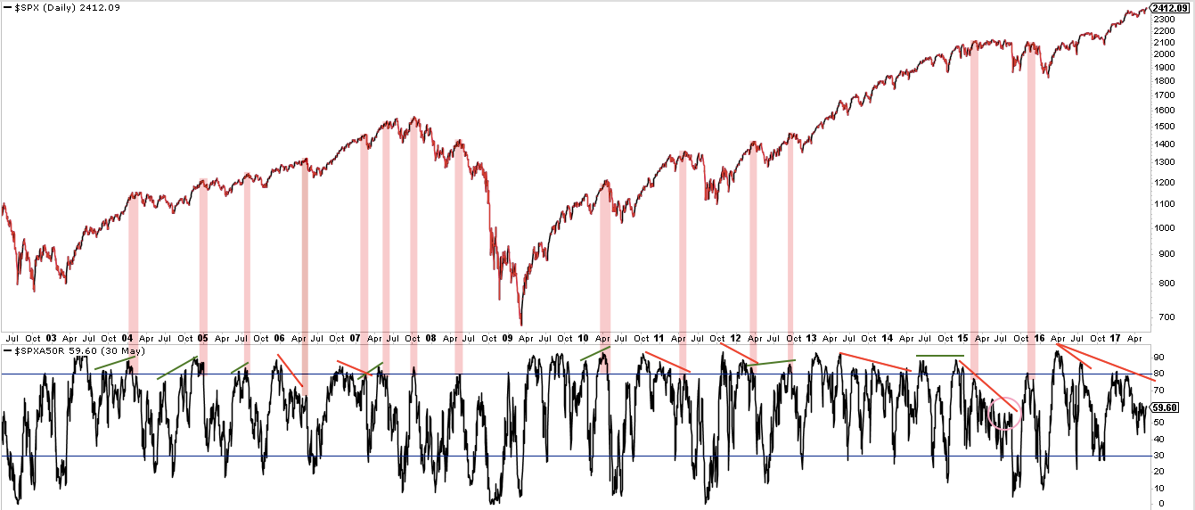
Spotting a "negative divergence" in hindsight is easy but there seems to be no useful way to act on a divergence in real time: stocks might fall this week or not until several months in the future or perhaps only after breadth has improved and the divergence no longer exists. And by the time the next correction arrives, the gains foregone might be many times larger than whatever loss ensues.
More to the point, the analytical work from Mr. Asness discussed earlier shows that the concept of weak breadth equalling an imminent market correction is false: a few stocks typically drive markets higher. The bulk of the market lags.
Lastly, let's consider the importance of the small cap index, the Russell 2000 (RUT). Because there are four times as many stocks in RUT as in SPX, some commentators believe that broadening breadth implies that the many small cap stocks should outperform the relatively fewer number of large cap stocks. And because SPX has gained more than 7% this year but RUT is up only 1%, this "divergence" is causing some consternation.
First, some background: RUT comprises 2000 companies with an average market capitalization of $850m. For the 500 companies in SPX, the average is over $30bn. These are small companies, much less followed by Wall Street analysts, in turn making them more speculative. The average beta of RUT is about 30% higher than SPX. This is key. When investors are bullish, you should expect RUT to outperform SPX. The reverse is also true when investors are bearish.
The chart below compares SPX (top panel) to the relative performance of RUT to SPX (bottom panel). When RUT outperforms, the line in the bottom panel rises.
And what we see over the last 23 years is that sometimes SPX rises to new highs when led by RUT (green arrows) and sometimes it does so when RUT lags (red arrows). The relationship is not in the least helpful to understanding SPX better.
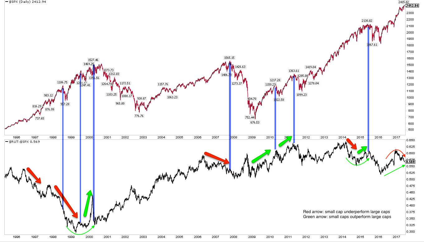
So, what's going on? While the theory that RUT's performance should provide valuable insight on the health of SPX sounds right, the reality is that this has empirically never been the case. A important reason for that is that RUT is a much smaller index than SPX, the Dow or the Nasdaq-100 (NDX). SPX represents about 76% of the total market capitalization of US equities. RUT is just 9%. The 6 largest components of the Dow have a greater combined market capitalization than all 2000 components of the RUT. It's not clear why a small subset should be expected to provide more useful insight on the health of US equities than SPX itself.
* * *
No single indicator is sufficient in assessing market inflection points. Using breadth has serious drawbacks. But over the past 5 years, the SPX has gained more than 3 times as much over the following month when breadth was weak compared to when breadth was healthy. Risk/reward has been more than twice as favorable when breadth is weak as when it is healthy. This suggests a far more logical and useful methodology for using breadth to anticipate market inflection points than "lagging breadth," "breadth divergences, " or outperformance by small caps stocks.
If you find this post to be valuable, consider visiting a few of our sponsors who have offers that might be relevant to you.